Monday, 25 April 2011

Evaluation - Video

In what ways does your media product use, develop or challenge forms and conventions of real media products?

Music Video

Before creating the video itself we undertook some research, this was finding the genre of the band, watching the original video and noting the conventional shots used in music videos of the genre.
We found out that The Fray are an alternative rock/piano rock band and that the types of shots used are conventional of rock music videos, these shots are band shots, close up of singer or other band members and close ups of instruments being played. The message behind the song and the lyrics were the influence for our narrative, the message was about how the lead singer has been fighting with his brother and in our video we have a conflict not between people but our singer and the creation of the band, also in the chorus the line "She's on your mind" is repeated but we have changed that to represent the thought of being in a band is on the singers mind.


Here we replicated the shot because we liked how the space created a sense of distance but the only difference is in the first image the shot is used during the narrative were as we have used it as the first shot of our singer. Another difference is that in the actual video they use a pan and track so that there is a parallel movement but we added a zoom so that the distance is then removed and the focus is moved to the singer.


This isn't the only shot we replicated there are often close ups of the singer and we have done this slightly differently because in the actual video the singer is with the band on stage whereas we have isolated the singer in seperate locations and rather than already zoomed in we have added a slow zoom. Also we noticed that a typical shot in a rock music video is close ups of instruments being played and we have followed this convention from the start.


But most of our video is nothing like the actual video were they have tried to portray a boy who doesn't fit in and is looking for acceptance, we have created a different story in which the singer tries to create the band. However there was a shot in the actual video that had influenced the groups most difficult shot and this can be seen partially in the first image above. As that shot continues along the lockers the lyrics appear and it says "I'm in over my head" we changed that and rather than show the lyrics we wanted to show the singers main thought and this was "I need you" which referenced the need for a band.


The biggest difference is that The Fray fall under the genre of Piano rock and the actual video often has close ups of a piano being played but we have not replicated this instead we replaced them with lots of shot with the band members playing instruments or close ups of their instruments. This can be seen in a short series of clips in which we use a constant cross dissolve revealing the individual members and then have a short close up of each instrument but we have kept each close up in the same order as the band members close ups just before them so that the audience knows who plays what instrument.


Evaluation - Main and Ancillary Task

 How effective is the combination of your main and ancillary texts?

At the beginning of the project I chose to create the concert ticket and billboard poster but also gained the t-shirt design and throughout there creation and development I have tried to link them as closely as possible to the video.

All of the images I have used have always contained every band member and this links to the video because every band member  is referenced and each seen several times during the video. I have also tried to ensure that the band wear the same or similar clothing to what they wear in the video but this was not always possible.

On the concert tickets I used the same style of images but on The Fray special ticket I have used an image where the singer faces a different direction to the other members but all the others face the same way, this was done to link the ticket to the video. In the video the audience find out about the band but don't find out till the end whether they are actually put together and on the ticket I created that image to show the message of our video.

For the billboards I used different images but the New York billboard I used an image that reflected some of the audiences feedback, this was confusion. Some audience members couldn't differentiate between our narrative and band shots and I decided to use that as a theme for the image used which is the band staring forward with a confused look on their faces. Although not directly linked to the video itself it could be seen as linking to a hidden theme presented in the video.

Evaluation - Audience Feedback

What have you learned from your audience feedback?

Throughout the development process audience and peer feedback has been an important factor to creating our video. We needed both because the audiences opinions would tells us if the video was appealing to watch or if it wasn't but peer feedback from other media students allowed for more technical criticism, by utilising both opinions it allowed our group to create a stronger video.

From our target audience we had often been told that the video may have been "to jumpy" or "the lip sync is out a little bit when he's singing" so after receiving this information we would return to the video editing machines and add transitions like cross dissolves so that the video flowed better or cut the clips so that the lip syncing is in time. 
The peer feedback we received could vary depending on who we asked some may have said "that transition doesn't fit" or "you should remove that zoom" these constructive criticisms gave use the chance to test new ideas and challenge our skills and build a better understanding of the program we were using.

Any feedback received helped to broaden and develop our ideas to create the final video and they also allowed our group to challenge ourselves in terms of difficulty of shots, the most difficult shot was the poster on the water shot but thanks to audiences telling us they liked that we then went to reedit or reshoot this footage.

Evaluation - Technology used

How did you use new media technologies in the construction research, planning and evaluation stages?


Throughout the process of creating the music video and all the ancillary tasks a range of programs were used and some different new media technology. The most frequently used programs was Adobe Photoshop CS3 which is a image manipulation program, this aided in the creation of all the ancillary tasks and editing of the images used.
Photoshop from the start was used to remove the background of the range of images used and this is evident in some of my previous posts. The program has also allowed me to enhance the images whether that be darkening the images or rearranging the image to make a better one, the program has allowed me to test my skills and develop them.
The next program used was Adobe Premier Pro CS3 which is a video editing software which allows the editing of clips to arranging shots in the chosen order. Although at the start I didn't have the knowledge of how to use the program throughout the construction of the video I gained valuable knowledge which gave me the experience to add motions to clips for example zooms and rotations or using the layers to create a graphic match. Premier Pro also allowed me to change the video as I wanted and this could be changing the transitions added or removing a clip and using the razor tool to cut the clip to a more appropriate section.
Premier Pro also has a conversion function which allowed our group to convert  different versions of the video and transfer them via a USB memory stick to another computer so that we could play the video to any audience to gain feedback ensuring that we made a video with a clear narrative and was entertaining.

Sunday, 24 April 2011

Evaluation - Ancillary T-Shirts


In what ways does your media product use, develop or challenge forms and conventions of real media products?

Band Tour T-Shirts


The image of the ACDC t-shirt was the best design I found from my research because it clearly shows the conventions of a tour t-shirt. I also chose to create different designs because from my research I saw that there are sometimes a variety of t-shirts sold at concerts.

I followed the convention of the ACDC shirt mostly on the third t-shirt this can be seen with the image on the front of the shirt and the tour dates on the back. All of the designs created follow the conventions of the band style and these are incorporated with the shirt conventions. For example all text seen on every t-shirt has the band colours and font but the second and third also have the band logo, which is a different custom brush but they are also all from the same pack.

The only differences between my designs and the ACDC shirt is that the image I have used contains all band members where as they have focused on guitarist and also both sides of the shirt have the band name but I have only placed them on the front and used the tour name on the back.

Evaluation - Ancillary New York Billboard

In what ways does your media product use, develop or challenge forms and conventions of real media products?

New York Billboard


For this poster I used the previously created poster as a reference point.  This time I decided to text wrap  the information, this was due to the shape of the image included. The positioning of each piece of text allows the advertisement for the song to be the last thing read by audiences. Again I have used minimal text so that the advertisement is straight forward and follows the convention of billboard ads, also like before I included an image of the band so that audiences know who they are looking at. This was also a convention used on other band posters.

Evaluation - Ancillary Band Ticket

In what ways does your media product use, develop or challenge forms and conventions of real media products?

Band ticket


I chose to create a seperate ticket because along with the research mentioned in the previous post I had found that some venues don't have any tickets that specifically have their venue or a house style so I also chose to create a band specific ticket for the other venues.

There are similarities between the images above and these are an image of the artist/band in the foreground and the logo with the band font. The image for my ticket was important because for the products I have created I have included a band shot. The design was simple because the image takes focus the font needed to be above but unlike the Prince ticket the information on the ticket is also in the band style.

There are a few differences between the tickets for example my ticket still has two bar codes so that the side of the ticket can be scanned and removed so that the main part of the ticket can be kept but also the sponsors aren't included on the ticket.


Evaluation - Ancillary London Billboard

In what ways does your media product use, develop or challenge forms and conventions of real media products?

London Billboard


To create this product I used the first image above as research and inspiration. For a billboard advert I needed to follow the main conventions that apply to these types of posters.

The conventions that I followed were to have a little information possible but the text seen is all important, this is crucial because the adverts would be placed close to roads were audiences will be travelling at high speeds. The text although doesn't follow the colour scheme still has the same font but the background does follow the house style of The Fray.

Although they are similar there is a slight difference and that is the first image has two sponsors that can be clearly seen but my poster doesn't have any sponsors, however unlike the Madonna poster my poster promotes the song itself.

Evaluation - Ancillary O2 Ticket

In what ways does your media product use, develop or challenge forms and conventions of real media products?

O2 Concert Ticket


To create the O2 concert ticket I undertook some research and found many images similar to the first image above, so to create my own ticket I needed to follow the conventions of a typical O2 ticket. The conventions of an O2 ticket is to have an image of the venue, the logo and two bar codes.

There are many similarities between my ticket and the real ticket this is because to create an authentic ticket I needed to follow the O2 conventions. The similarities are I included two bar codes, the O2 logo and I also included an image of the venue.

However there are differences for example I have included an image of the band on my ticket and the band font, this was done so that the ticket stands out from the other O2 tickets. From my research I found that many people like to keep the tickets as souvenirs so I added these changes so that the concert and ticket becomes more memorable.

Thursday, 24 March 2011

The Fray Ticket version 3

I have added a small bar code because having to bar codes follows the conventions of a concert ticket.  

The Fray Ticket version 2

This version now also includes the date so that the owner knows when the concert is.

O2 Ticket version 2

I added the band name and tour name so that the ticket links to all products created. This was done due to audience feedback, it was unclear who the band were and what tour it was.

Wednesday, 23 March 2011

The second billboard design

This is the second design that I have created. The reason I created this billboard poster was because I chose to make seperate designs for each tour location.

To create the background I used a black rectangle. The custom brush was added on a seperate layer and enlarged to fill the canvas. The text are all seperate text boxes, all the font is the same to keep everything consistent.

This is the original image.

I used the magic wand tool to select the green background so that I could remove it. However due to the lighting the green was different shades so I increased the tolerance and used the eraser tool to remove any remaining green. The most difficult to edit was the hair because the green had been in smaller areas so I used the clone stamp to draw over the green background.

Tuesday, 22 March 2011

Filling the gaps in the video

Thanks to the emergency we have filled the gaps in our video. Now we have a full video we can focus on adding transitions and movement.
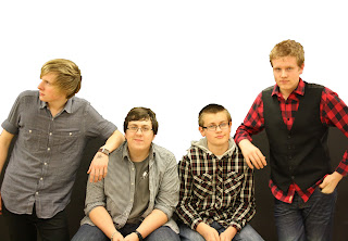
 In this image I am cutting up different clips to find the best footage to include.

In this image I am attempting to order the clips and find the most appropriate places for the new clips.

Friday, 18 March 2011

Emergency video shoot

15/3/11

Today we undertook a final video shoot. We were stuck and unable to fill in a 15 second gap in our video, due to a lack of footage. So we did an emergency session filming at Erith pier.

Here is a shot of our location, the pier faces the river Thames
Here is a picture of the cast moving to the next location in front of the pier
The image shows a boat in the distance and the weather help to add the atmosphere we wanted. The weather was fairly dark, gloomy and foggy so this added to the singers misery.

Thursday, 10 March 2011

Third t-shirt design version 2

To link this design to the other products created I added custom brushes to both the front and back. This is to show the bands logo.

Wednesday, 9 March 2011

Second T-shirt design version 2

I decided to add a custom brush to the back of the t-shirt because it didn't link to the other products. The custom brush and colour scheme were intended to be the band logo, therefore I added the brush so that all the products have the logo

Third video shoot

3/3/11


Today we went to film the last of our footage. This footage was mostly narrative shots, and I took the role of the camera man however I also got my own cameo appearance in the video.

Thursday, 3 March 2011

The Fray Ticket

After the the photo shoot I created another ticket. However this ticket I decide to make specific to the band, this is because my research showed that bands who have done tours tend to have a ticket that has their logo or something relevant to their latest material.


To create the background I used a black rectangle and on a seperate layer I used a custom brush. The side bar was created using a white rectangle and the bar code had been copied from the Internet. The main image is four edited images merged together to create the image seen. 

Monday, 28 February 2011

Third t-shirt

This is the third t-shirt design I have done. Although all designs are similar this so that they all follow the conventions of the band products.
This design has the same template but this time it has an image. The image was edited so that hte green that was behind it was removed and then the image was resized to fit on the t-shirt. However the image didn't properly fit so I used the clone stamp tool to fill in the gaps.

Second video shoot

6/2/11


Today we filmed more of our video, this was necessary because the footage taken before was a poor quality. During the filming I was the cameraman.


 This image I was trying to set up a solo mid shot of the guitarist.


 Here I was filming Kyle walking down an alleyway, this was a slow zoom out which led to mid shot.


 Here was a still shot of the zoom and track.


This shot was during Kyle was singing. To make lip syncing easier we made sure that Kyle had the song to sing along to.


 I used the top of a staircase that was on location to replace the Jib, a piece of equipment we didn't have because it is broken, this allowed us to get a high angle shot.


During the filming of this shot I tried to tell each member were to stand so that each could be seen in the footage.

Billboard

The billboard advert I have produced  it part of a series I plan to create, each variation will feature in different cities that the band will appear in.
 This is the partly edited image that appears on both versions of the billboard.


To create this billboard, I began with a black rectangle to create the background and then created seperate layers for the custom brushes used also in the background. The main image was then placed and resized to fit the page and the faded brush in the foreground was put in a seperate layer.
This version will not be used because the colour scheme, although fitting with the band colours, was making the text unreadable.
This version is similar but some small changes have been made. The background shapes have had the opacity reduced and the stroke around the main text has been changed to white. Although the colour doesn't match the band colour scheme it allows the text to be easily read.

The second photo shoot

27/1/11

Today we undertook another photoshoot but this time rather than taking general shots we took photos specific to our tasks. During this shoot I was mainly the photographer and this time we used a green screen so that the images will be easier to edit, rather than use the black screen which matches the colours worn by the band.

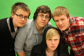
 This image is an example of the types of shots we took. This image is one of many which feature the other members all facing the same direction.


 Here is another example of the range of images we took again the individual band members face the same direction.


 This image of the two guitarists was taken for the magazine cover that will be a special featuring The Fray.


 Here is again one of many shots similar however in each variation the band are using different expressions. These images may feature on the ancillary tasks.


This is an image of Kyle and myself putting the equipment up.

This photo shoot will be the last we undertake because the shots are now more specific to the tasks.

Second t-shirt

I have done a second design which links closer to the rest of the ancillary tasks. This t-shirt was created using the first design and this time I have used a custom brush and placed it on a seperate layer from the t-shirt so that it can be easily placed. The brush will be seen on most of the ancillary task from here on out, the similar brushes could be seen as a part of the logo.

T-shirt design

This is the first t-shirt design I have done. The image started as a template and I used the colour filler to turn the originally white templates to black. Then I used the magnetic lasso to create the yellow lines, the text was added using a text box and then I added a stroke.

I plan to produce more designs and will post them as soon as they are completed.

First video shoot

2/1/11


Today the group went out to film the first clips for the video, however I was unable to attend because I was away.

Tuesday, 15 February 2011

The O2 Ticket

After the photo shoot I began to design the O2 ticket.

 This is the draft copy. The main image I used the magic wand tool and quick selection tool to remove the background. The background was a seperate image that was cropped and stretched.

This is the final ticket. The main image was edited again this time the band has been moved closer together, this was done by removing the member to the right. Along with main image the box to the left was made larger.

Our First Photo Shoot

24/11/10
Today we undertook the first photo shoot. I had the role of the photographer and below are some of the photos taken.

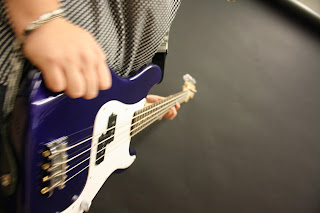
This shot was taken at a low angle and close to the guitar so that the elongated effect is given to the guitar.

 This photo was taken as a mid shot. However the image wasn't used because there is a band member missing.

This image was taken at as a mid shot and was intended to be used in the ancillary tasks, however the image was to bright and difficult to edit. 

This image was taken for the ticket but was not used because it was the wrong shot.

We will be undertaking more photo shoots and begin filming soon.